AboutMe Online Health History - Reducing friction for life insurance applications

As the Lead UX Designer, I was tasked to imagine and execute a simpler way for life insurance applicants to complete their health history by offering an alternative to the current tele-interview process.
Business
Pacific Life Insurance, HatchLab
Scope
Transform the traditional insurance application and underwriting process into a digital experience
Timeline
09/2020-09/2021
My Role
UX Lead: stakeholder alignment, cross-team collaboration, user research, UI design, storyboarding
ENTERPRISE
〰️
DIGITAL TRANSFORMATION
〰️
HEALTHTECH
〰️
UX STRATEGY
〰️
USER RESEARCH
〰️
UI DESIGN
〰️
ENTERPRISE 〰️ DIGITAL TRANSFORMATION 〰️ HEALTHTECH 〰️ UX STRATEGY 〰️ USER RESEARCH 〰️ UI DESIGN 〰️
01
Project Outcome
Following the launch of the Online Health History feature in September 2021, we consistently received positive feedback from over 500 users, achieving an impressive average satisfaction rating of 4.3 out of 5.
Here’s what we heard from users:
"Easy to Follow and Flowed Nicely"
"Very easy and efficient!"
"Fast and convenient."
02
Project Background
Before Online Health History, when our users applied for life insurance, they would have to go through the telephone interview process to provide their health history information. This can be a very bumpy user experience and full of room for error.
As the business continued to look for more ways to innovate and transform the traditional underwriting* process, the ask was to digitalize and streamline this experience by designing and introducing the AboutMe Online Health History Questionnaire.
*Insurance underwriting is how an insurer decides how risky it is to issue coverage to a certain person or business.
03
The Challenge
Today life insurance applications are mainly through telephone interviews, which is full of friction (listed in the bullet points below) while also driving up business costs. I was hired to digitize an Online Health History Platform to help applicants qualify for life insurance. Before Online Health History, when prospective customers were applying for life insurance, they would have to go through a painful telephone interview process, which also demanded significant human resources from the company.
While phone interviews allow insurers to quickly collect information, they present unique challenges compared to in-person or online applications:
Disclosure of sensitive information
Time pressure (average call duration from 30-40mins)
Lack of support for complex questions
Recalling specific details
Inconsistent questioning
Here's an example of the telephone interview questionnaire—notice how complicated and impersonal the questions are!

04
Design principles informed by user research and competitive audit
Informed by 12 user interviews with insurers and a competitive audit, I identified key design principles to design the new online health form.


An Intentional Digital Experience
Online Health History isn’t just an online form; it must be an intentional and unmistakable digital experience.

Set Expectation & Show Progress
Design momentum so it feels like “I’m moving forward”.

Data Accuracy
Be specific about time, and avoid lengthy manual text entry.
05
The Customer journey illustrated the end-to-end experience and helped stakeholders understand how design principles might be expressed through the experience
After aligning with the business on the key features to be included in this online questionnaire, I created this illustrated customer journey to tell the story of the applicant across different touch points of the experience. (The screenshots were replaced later.)

Alex receives invitation email on his Phone.

He can easily reach out to AboutMe customer service for help.
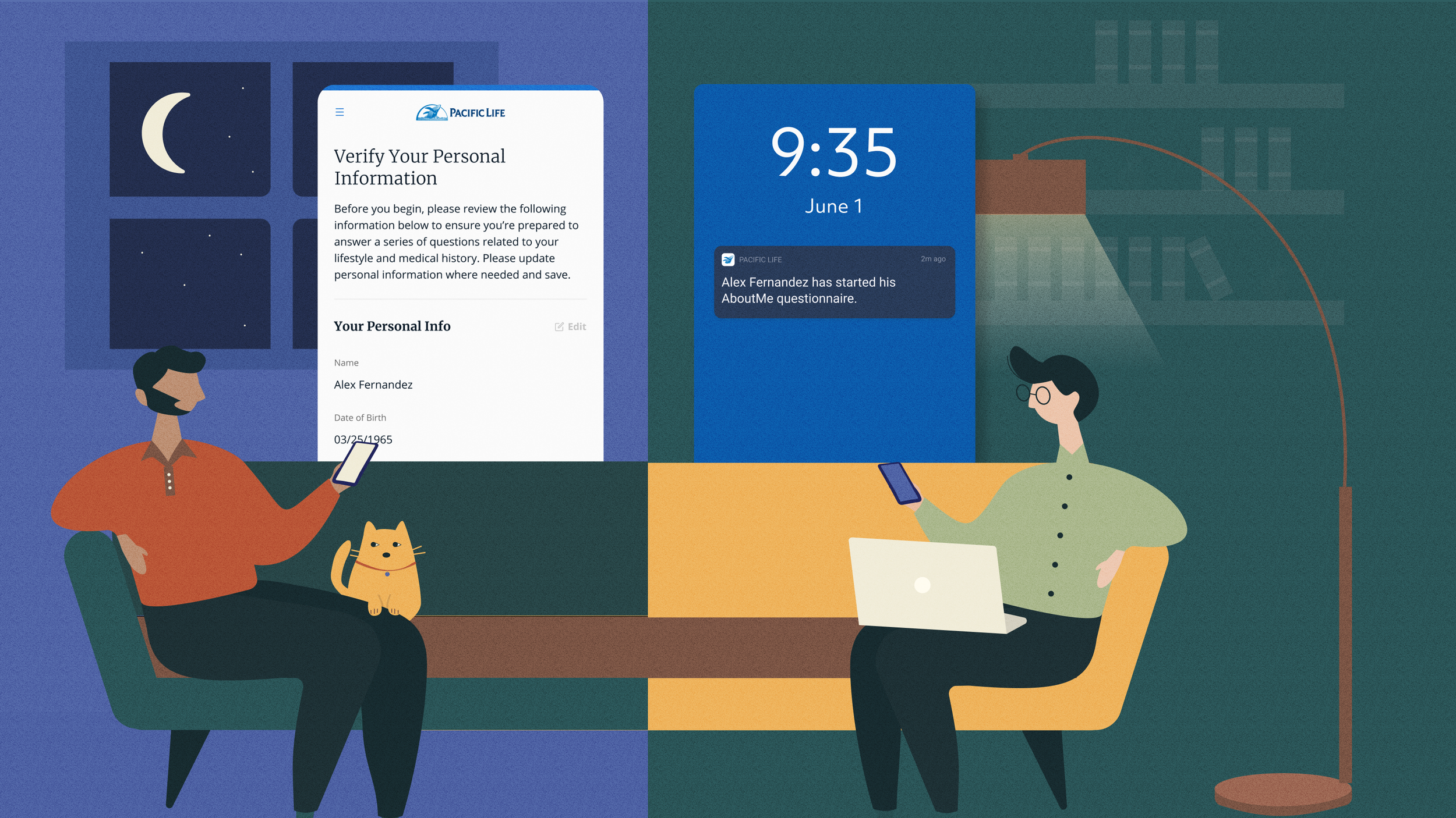
Alex logs in on his phone. His financial advisor Jack is notified.

He has the chance to review all his answers before submit.

Alex starts filling out form.

Alex provides e-signature easily within the same process.

When Alex steps away, his progress is auto-saved.

He gave us a 5-star review after submitting his online form.
06
CONTENT
Collaborating with the script team to translate oral inquiries into digital formats
Look into the complex verification process today to get a better grasp of what I'm designing for and the overall scope.


“I'd love to be able to do this on my phone, so I can easily fill it out while I'm in an Uber to the airport or waiting at the doctor's office.”
Alex, prospective policyholder
07
Online Health History isn’t just an online form; it must be an intentional and unmistakable digital experience.
Design Principle 1
Step 1: Establish expectations through thorough communications
Before starting application:
Email invitation clearly outlining next steps, point of context and easy way to get started right away.

During application:
Landing page that provides context about what to prepare, estimated completion time, how this information will be used, ways to reach out for help, etc.


After submitting application:
Confirmation page with clear next steps followed with an email confirmation.
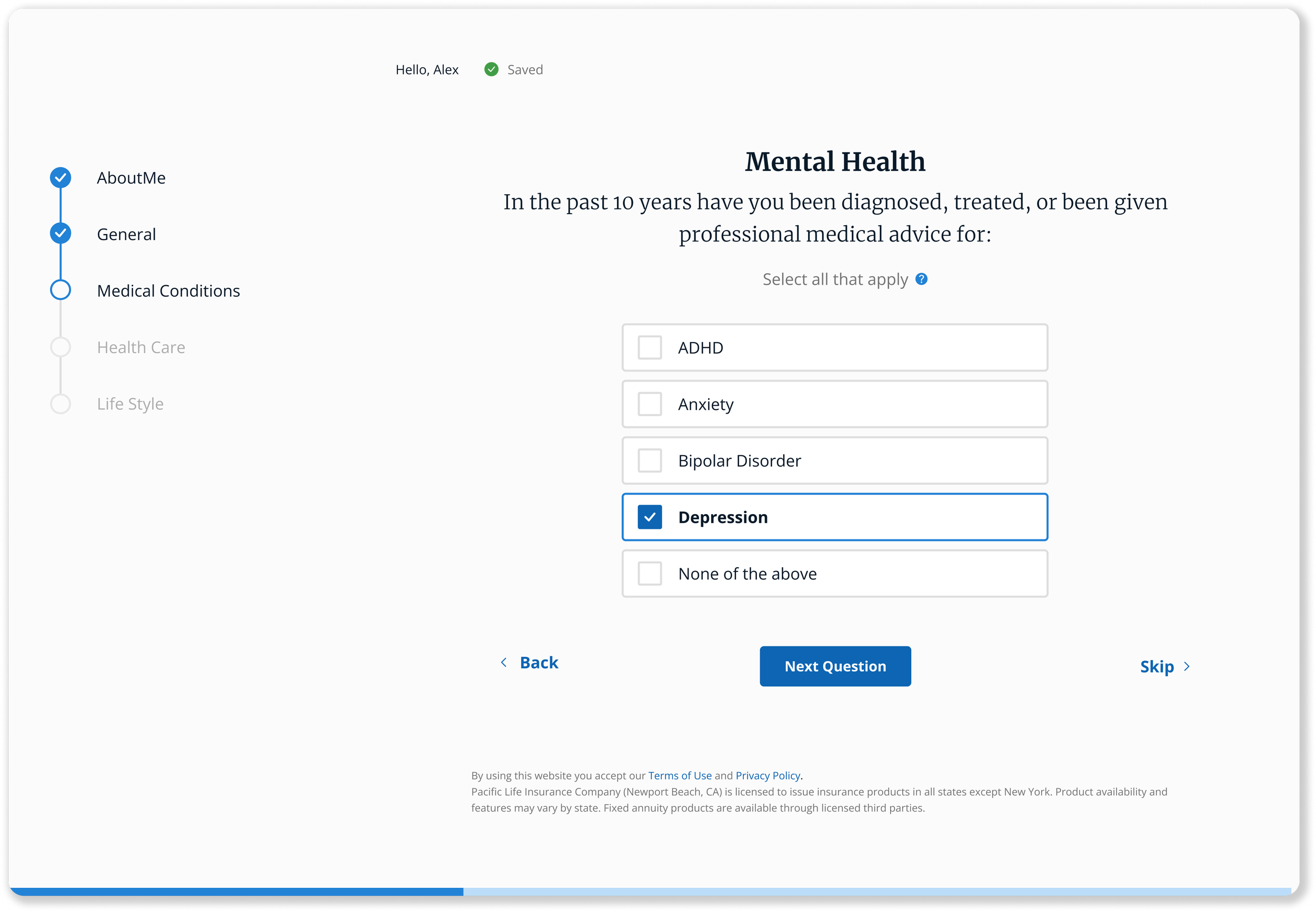
Step 2: Build the Information Architecture of the Questionnaire

Group questions by medical category for better clarity and focus

Add reflexive questions based on user responses to save time by skipping unnecessary questions.


Designed a mobile-friendly experience so users can complete the questionnaire anytime, anywhere.
Step 3: Mobile First


“The questionnaire takes 20-30 minutes. I'd like to see my progress, know it's saved, and be able to pause and return anytime.”
Alex, prospective policyholder
08
Show progress and design momentum so it feels like “I’m moving forward ”.
Design Principle 2
Design & tested 3 ways to visualize progress:
Option 1: top progress bar

Option 2: breadcrumb style progress indicator, with a completion percentage bar at the bottom

Option 3: left progress bar, with a completion percentage bar at the bottom

Option 3 is a winner with a few iterations:
Users like option 3 because:
Prefers left/right composition for clearer and more structured questionnaires
The progress bar helps users quickly gauge how far they've come
User feedback for iteration:
Each section of the progress bar contains many questions—further breakdown would be helpful.
The progress bar at the bottom is easily overlooked. It should be more prominently placed with a number for added context.
Include a point of contact so users can easily reach out for help
“I can’t remember my doctor’s phone number on top of my head. Also please don’t ask me the same question twice.”
Alex, prospective policyholder
09
To ensure data accuracy, I helped the users save some time with auto-search and auto-fill
Design Principle 3
Auto-Search
Many applicants, like Alex, don't remember their doctor's phone number or address offhand. Adding an auto-search feature from a database would save users the hassle of searching online or digging through medical documents. This also improves data accuracy by reducing manual entry errors.


Auto-Fill
Repeatedly answering the same questions is frustrating. Pre-filling previously entered answers can save time and greatly improve the user experience.
10
Post-submission
The journey doesn’t end here
As part of the design delivery, I have incorporated the post-submission journey for the insurer. This includes an integrated DocuSign process, facilitation of paramedic exams, and a follow-up email confirmation including all pertinent details.
Prompt users to schedule paramedical exam immediately after submitting their application
After users scheduled their paramedical exam, show a quick survey for them to provide feedback so that we can better improve the experience of the platform.

View final prototype:
Redirect users to the DocuSign page to submit their e-signature, then seamlessly return them to the platform
After users successfully submit their application and schedule the paramedic exam, send a confirmation email outlining the next steps in a clear and concise manner.

11
Project Outcome
Following the launch of the Online Health History feature in September 2021, we consistently received positive feedback from over 500 users, achieving an impressive average satisfaction rating of 4.3 out of 5.
Here are some of the reviews we heard from the users:
"Easy to Follow and Flowed Nicely"
"Very easy and efficient!"
"Fast and convenient."